Case Study

PÜRSU Paper — 7 departments, 8 spreadsheets and one ERP report

Month-end close took 11 days. The CEO saw last month's numbers on the 15th.

Important: PÜRSU Paper is a case study built to demonstrate ATLAS end to end. The company is representative; its data structure, department count and reporting flow mirror a real manufacturing business closely. The dashboards and warnings below are the actual output ATLAS produced on that data.

Before

Month-end close takes 11 days. Production output lives in the shift log; timesheets are on paper. Every department sends its own spreadsheet, someone merges them, and the numbers do not match. The CEO sees last month's picture on the 15th — far too late to intervene.

After

He opens the dashboard in the morning. He types his question. He gets his answer. Production is entered from a tablet, timesheets from a screen. Month-end close becomes a formality — because the numbers are already current every day.

What ATLAS caught

The questions nobody was asking

📈

You are growing, but not collecting

“Revenue is above target at 104.6% — but overdue receivables are at 58.9%. Target is 35% or below. There is ₺14.9M at risk in the 90+ day bucket.”

⚠️

Single-supplier risk

“28.8% of your purchases come from a single supplier. One disruption there stops production entirely.”

🔻

The loss-making month

“August is the only loss-making month of the year. Revenue fell while fixed costs stayed the same.”

Note that none of these is a “report”

Every one of them is a sentence. ATLAS does not hand you 40 pages of tables; it tells you the three things you need to look at. You ask for the rest if you want it.

Dashboards

Seven departments, seven dashboards

The screens below are real ATLAS output produced from PÜRSU data. Every dashboard carries a target vs. actual comparison and status labels (On Target / Watch / Off Target).

The screenshots are from the live Turkish deployment, so the dashboard labels appear in Turkish. The interface is available in English as well.
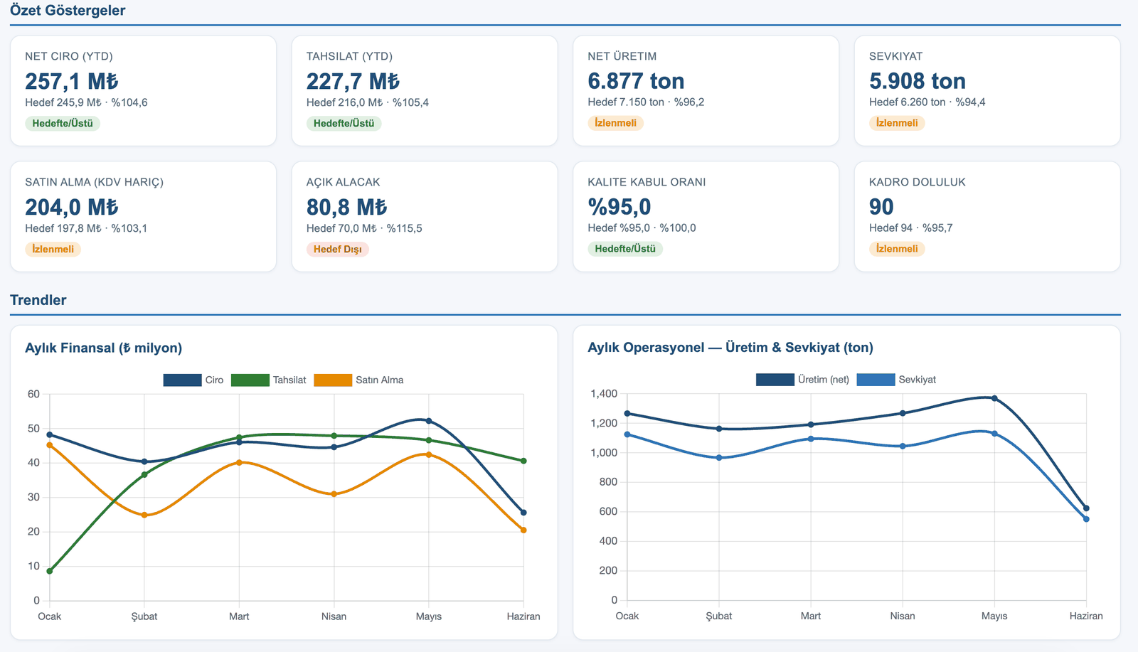
Executive dashboard — revenue, collections, production, logistics, procurement, open receivables, quality, headcount
Executive Management. Eight KPIs on one screen. Revenue and collections are “On Target / Above”, open receivables are “Off Target” — there is growth, but the money is late.
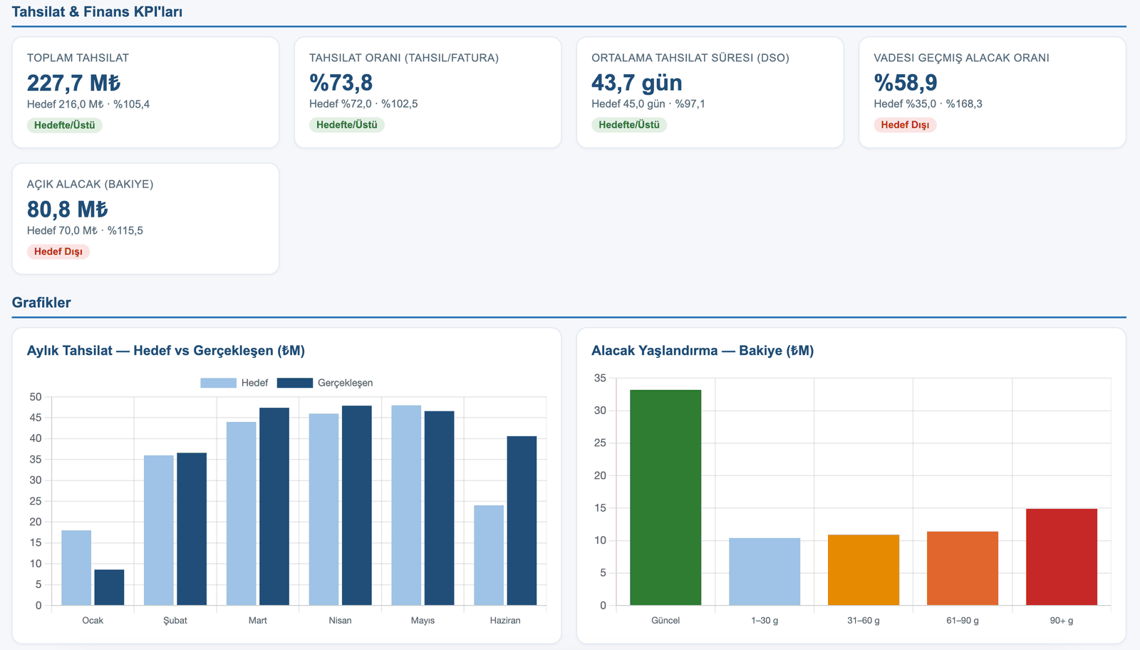
Collections and finance dashboard — DSO, overdue receivables ratio, receivables ageing
Collections & Finance. Overdue receivables are at 58.9% — 1.7 times the 35% target. The ageing chart shows the risk in the 90+ day bucket in red.
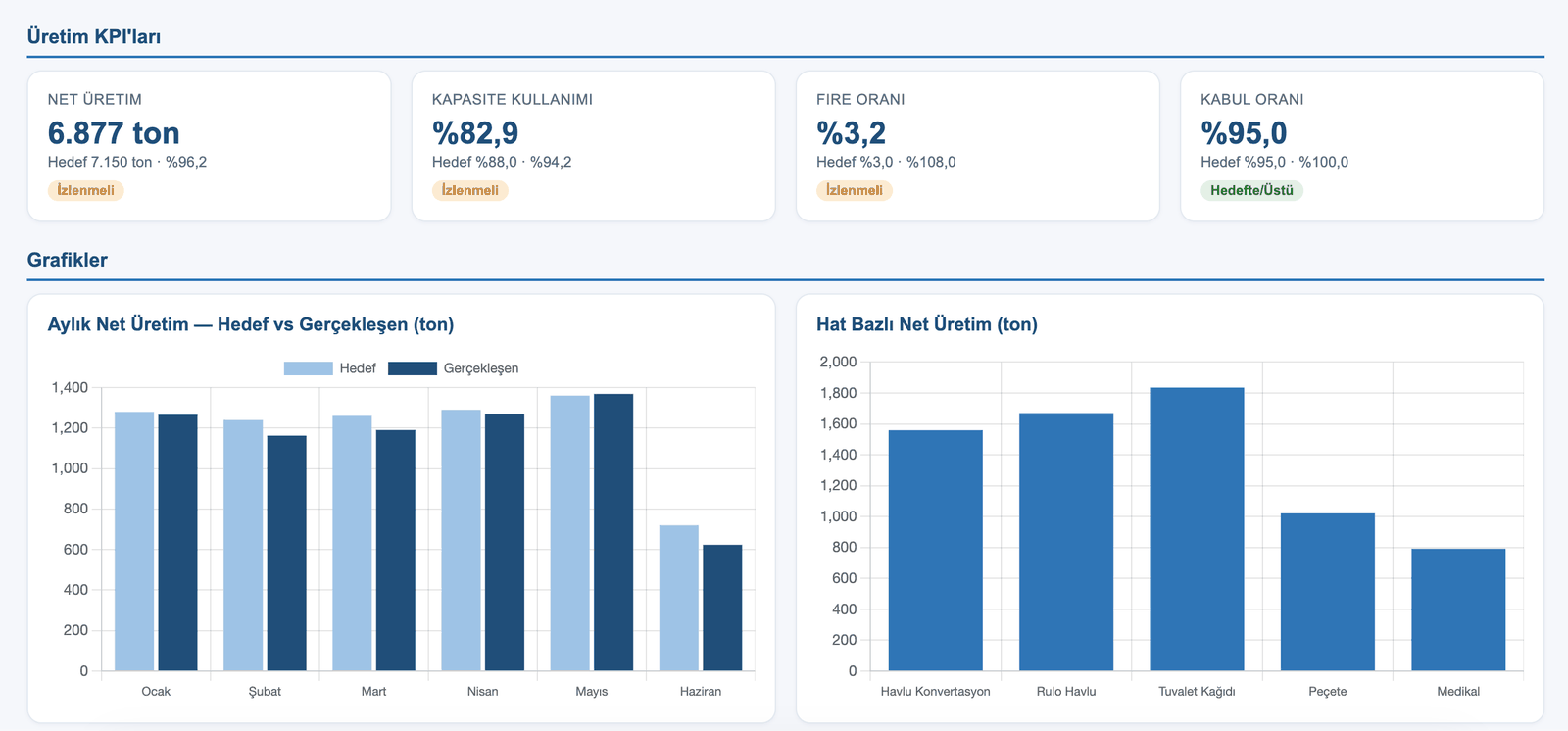
Production dashboard — net output, capacity utilisation, waste rate, acceptance rate, output by line
Production. Waste rate is 3.2% against a 3.0% target — “Watch”. The by-line chart shows directly which line is falling behind.
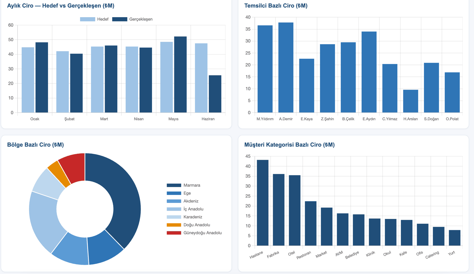
Sales dashboard — monthly revenue target vs actual, revenue by rep, region distribution, customer category
Sales & Marketing. The revenue-by-rep chart shows who is below target without leaving room for argument. The region split makes the weight of the Marmara region visible.
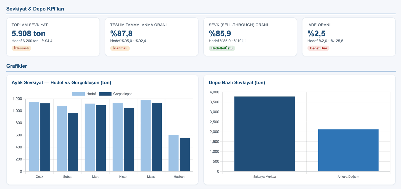
Logistics and warehouse dashboard — total shipments, delivery completion rate, sell-through, return rate
Logistics & Warehouse. The return rate is 2.5% — 125% of target, “Off Target”. A signal that should be read alongside the quality dashboard.
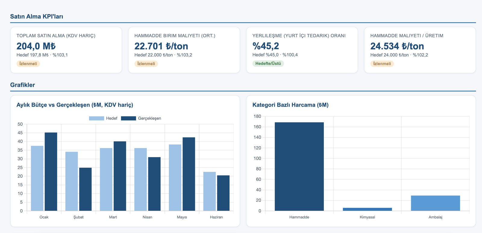
Procurement dashboard — total purchasing, raw material unit cost, local sourcing ratio, spend by category
Procurement. Raw material unit cost is ₺22,701/tonne — 3.2% over budget. Most of the spend is concentrated in a single category (raw materials).
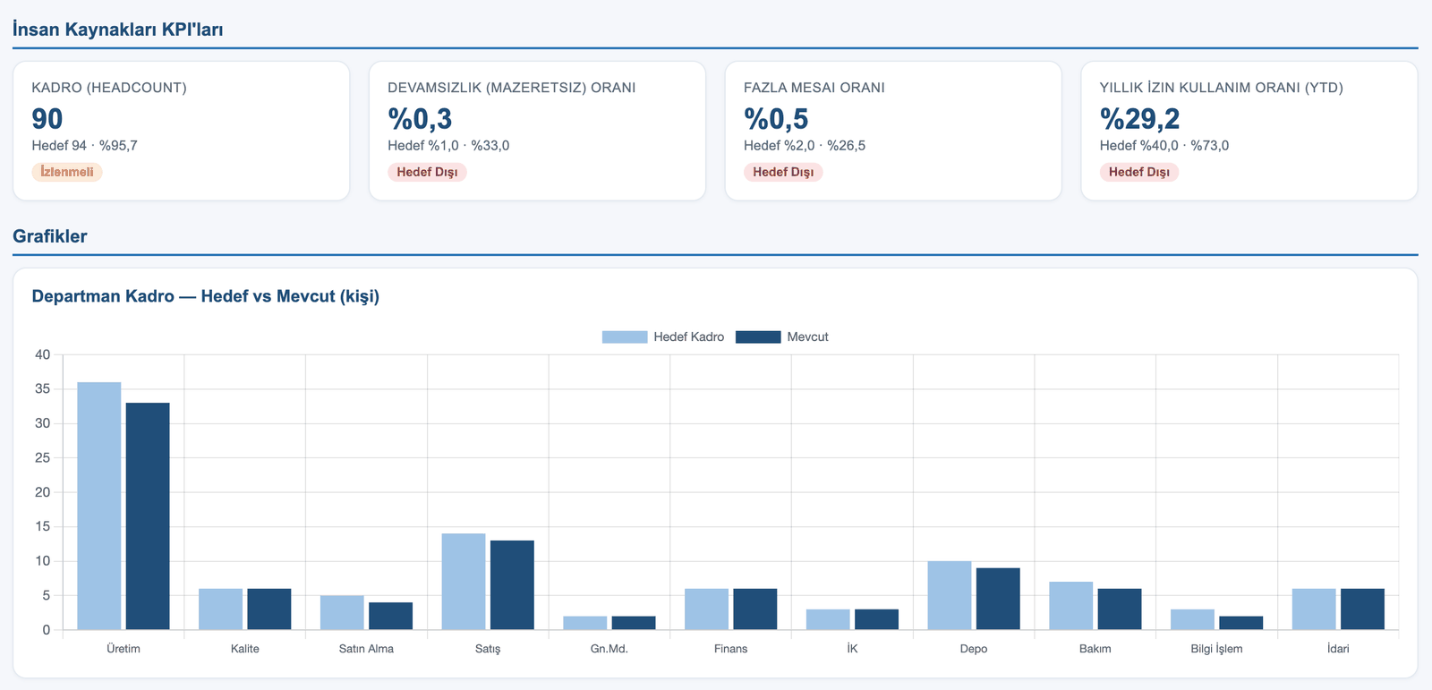
Human resources dashboard — headcount, absenteeism rate, overtime ratio, annual leave usage, headcount by department
Human Resources. Annual leave usage is 29.2% — far below target. Accrued leave becomes both a cost and a capacity problem later; ATLAS flags it now.

What would ATLAS find in your data?

If you are curious, the way to find out is a 30-minute demo.

Request a live demo